That’s the best piece of advice you’ll ever get in logo design. However, it’s also advice that can inadvertently get you in trouble. Draw a blue circle on the screen and you’ve just stolen the Blaupunkt logo. Draw a yellow line and you’re copying Visa. Draw a black swoosh and you’re ripping off Nike. The less intricacies involved in creating your masterpiece, the more likely it is that someone has already created it.
This subject has resurfaced in my head this week because of a couple of questionable logo unveilings, and I think it deserves some discussion. First, let’s go over the three categories of what might be considered “logo theft”:The shameless pixel-for-pixel ripoff
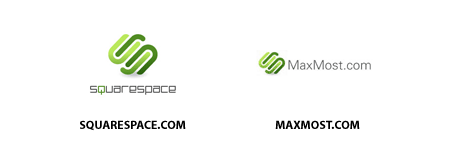
Master illustrator Josh Williams posted earlier this week about a company called MaxMost.com who was displaying as their logo an exact pixel-for-pixel copy of the logo he had earlier created for SquareSpace. The two logos are pictured below:
It is obvious, even to the untrained eye, that the similarities here are no coincidence. Everything is perfectly identical, right down to the shading of the elements. This sort of theft is not very common, because it is a) blatantly illegal, b) blatantly immoral, c) hardly defensible, and d) easily discoverable. For these reasons, it is almost never the fault of the company who is displaying the logo and can almost always be traced back to a dishonest person (we won’t call him/her a “designer”) outside the company who was contracted to produce something.
If you run across this sort of theft, it’s best to contact the company with your complaint, but be fully prepared for them to honestly have no knowledge of the theft. Logo theft is a crime. Hiring someone who commits logo theft unbeknownst to you is very unfortunate, but hardly a crime. It is, however, the company’s responsibility to rectify this theft the instant it is verified. To MaxMost’s credit, they appear to have dealt with this incident satisfactorily as of the time of this writing.
The independent, inadvertent facsimile
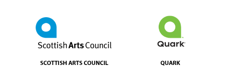
This is perhaps the most frustrating logo design pitfall that can affect a company. In a nutshell, an organization spends a lot of time and money on a new identity (whether in-house or through an agency) only to launch it and find out the exact same mark already exists elsewhere in the world. This situation bubbled up this week with the unveiling of Quark’s new logo. As seen below, it bears a striking resemblance to the identity for the Scottish Arts Council:
I am not inclined to believe that Quark, being so involved in the design community, would intentionally rip off any other organization’s logo, let alone a a non-profit entity like the Scottish Arts Council. Is it possible that whoever designed the Quark logo has once seen the Scottish Arts Council logo and it is buried somewhere in his/her collective unconscious? Sure, but it’s certainly a stretch to infer that there was any foul play here.
This is the worst sort of situation in identity design because a) it’s an identical mark, and b) in most cases, you aren’t going to know about the existence of the other mark until the design process is over and the whole world gets a peek. By this time, a company like Quark is already out probably five to seven digits depending on design fees and the cost of any materials or campaigns that have already been produced.
Most serious design firms will do a bit of due diligence to verify that their creations have not already been created before, but there are limits to this sort of research. It’s unfortunate, yet completely understandable, to me how the Scottish Arts Council logo slipped through this test. That said, there is certainly a strong case now that Quark is in the wrong if they decide to use this logo moving forward.
The inspired mutation
This is by far the most common form of logo dispute. A designer has consciously examined hundreds of logos in his or her life and subconsciously absorbed thousands more from billboards, magazines, and all the other distractions of capitalist life, and when asked to create one for a client, he or she draws on these influences to create something which may or may not be judged as “original” in the end.
When a designer succeeds in this endeavor, he or she creates something which passes the general public’s originality test, whether or not any existing influences are apparent. When the designer fails, however, the work is viewed as a derivative ripoff. The line between success and failure in this case is often fuzzy, as shown below in this illustration:
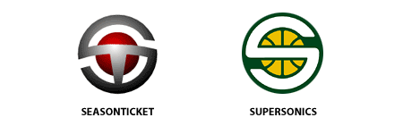
The logo on the left is one I designed as Creative Director for Seasonticket.com, an online video startup back in 2000 owned by Howard Schultz, founder and chairman of Starbucks. The logo on the right is the mark unveiled by the Seattle Supersonics right after they were purchased in 2001 by, guess who… Howard Schultz. The Sonics contracted a local Seattle design firm, Hornall Anderson, to design the mark, and I of course can’t say for sure whether theft was involved, but I do know Howard liked the Seasonticket logo quite a bit, and I also know he handpicked the firm to perform the redesign (usually the NBA does it), so I of course can’t help but be suspicious. When you go to Sonic games, even the 3D animation of the logo on the arena screens is almost identical.
If I was a litigious person, I’d consider taking action, but for now, I just don’t drink Starbucks coffee. And in case you’re wondering, no, Howard does not own the rights to the Seasonticket logo. And heck, for all I know, another very similar logo already existed before I created that one.
Anyway, enough about that particular situation. It pissed me off when it happened, but I’m over it. Unfortunately though, this same situation occurs almost every day and given that sometimes the marks aren’t exactly identical, there’s often not a lot you can do about it.
Source: mike industries
This is dummy text. It is not meant to be read. Accordingly, it is difficult to figure out when to end it. But then, this is dummy text. It is not meant to be read. Period.
ConversionConversion EmoticonEmoticon