It gets more and more difficult to create original logos. No matter
how clever your idea, the chances are someone has come up with something
very similar. Why is that?
Well, we’re all surrounded by the same influences and exposed to the
same shapes, forms, and patterns.
With the importance of branding in the marketplace, and thousands of designers working on similar projects, it’s obvious that ideas will, from time-to-time, look almost identical.
With the importance of branding in the marketplace, and thousands of designers working on similar projects, it’s obvious that ideas will, from time-to-time, look almost identical.
Here I have compiled a few similar logos, showing them side-by-side so you can see what graphic designers face today.
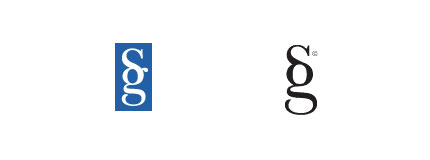
Sumpter & Gonzalez LLP and Stylegala
National Film Board (recently updated) and Virtual Global Taskforce

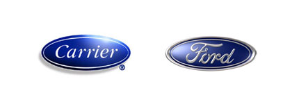
Carrier and Ford
Scottish Arts Council and Artworkers

NBC and Nebraska ETV Network

One Spa, Manulife One and Penzeys One Magazine

SimpleBits and LogoMaid (LogoMaid link directs to a Flickr thread with a fascinating commentary)

pseudoroom design and Cyberathlete Professional League

Ubuntu and Human Rights First

Graphic Design Blog and Peter GI

Star Sports and maltastar.com

Sun Microsystems and Columbia Sportswear

Applied Materials and Planned Parenthood

searchmash and smashLAB

Wayback Machine and Google Blogoscoped

Beats by Dr. Dre and Anton Stankowski‘s 1971 Stadt Bruhl logo

Not to mention the BigFix and Priority Parking logos
British Paints and Pagan Osbourne

LA Lakers and LA Clippers

Belfast City and South Hams Food and Drink

Blackburn Market and Barrow.

Heart Radio
Sinar Mas and Airbus

Source: logo design love
This is dummy text. It is not meant to be read. Accordingly, it is difficult to figure out when to end it. But then, this is dummy text. It is not meant to be read. Period.
ConversionConversion EmoticonEmoticon